Designing Alarm UX That Users Can't Ignore
The psychology behind Flashcards Alarm's forced-study interaction — and why making your app slightly annoying is sometimes the right UX decision.
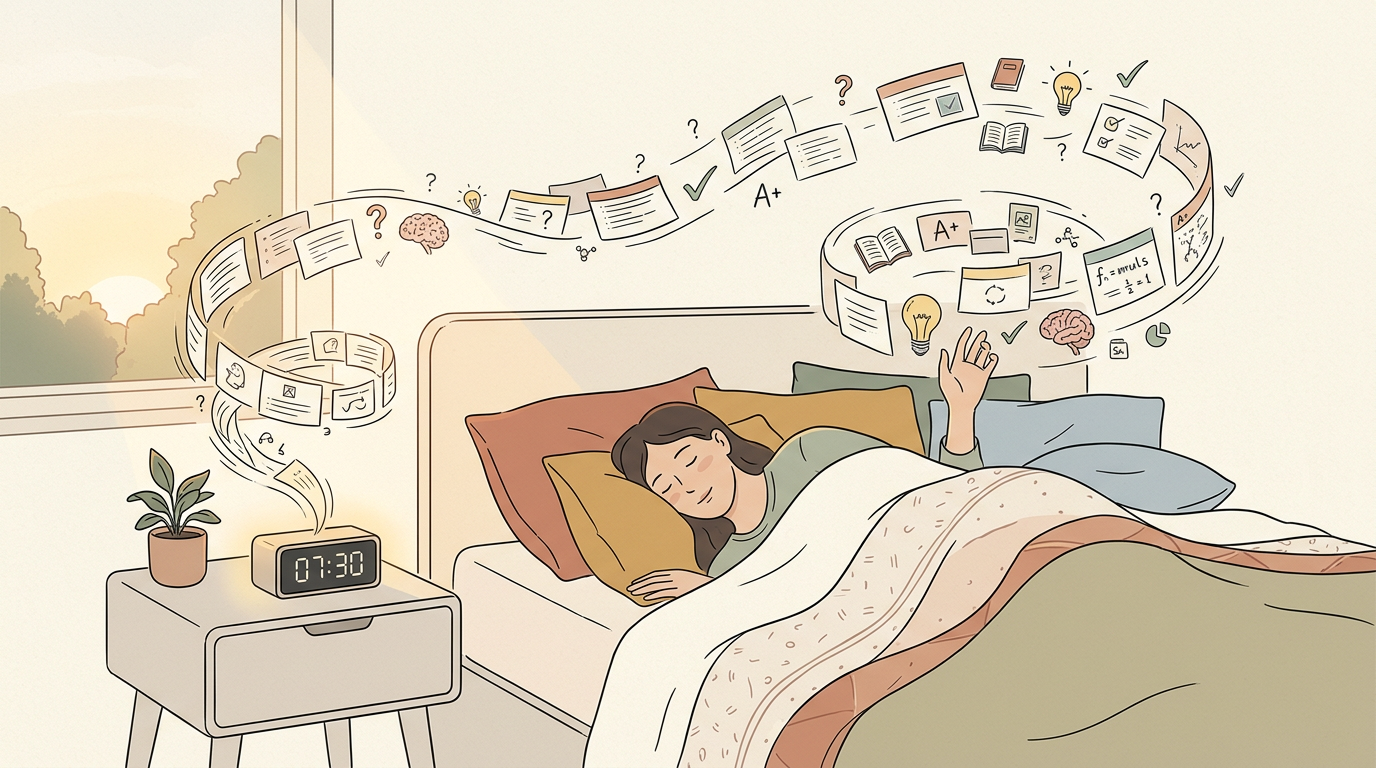
Here's a controversial UX principle: sometimes the best design is the one that prevents the user from doing what they want. In Flashcards Alarm's case, what users want at 7 AM is to hit snooze. What they need is to study.
The research behind this approach draws heavily from behavioral psychology, specifically B.J. Fogg's Behavior Model and the concept of commitment devices. A commitment device is a mechanism that binds your future self to a course of action — like giving a friend $100 to hold until you finish a project. Flashcards Alarm is a digital commitment device: users set it up when their motivation is high in the evening and the studying happens when their motivation is low in the morning. The alarm enforces the commitment regardless of how the user feels when it rings.
“The psychology behind Flashcards Alarm's forced-study interaction — and why making your app slightly annoying is sometimes the right UX decision.”
The core interaction is deliberately friction-ful. When the alarm rings, the only way to dismiss it is to correctly answer flashcard questions. There's no skip button, no 'remind me later', no escape hatch. You study or you listen to the alarm.
We tested several dismissal mechanisms before landing on the flashcard approach. Early prototypes included math problems, pattern matching, and even physical challenges like shaking the phone 50 times. Math problems felt punishing rather than productive — users weren't learning anything useful. Pattern matching was too easy to complete while half-asleep. Physical challenges were novel but had accessibility concerns. Flashcards hit the sweet spot: they require genuine cognitive engagement, the content is user-chosen and meaningful, and each dismissal session is a legitimate micro-study session that contributes to real learning outcomes.
This sounds hostile, but it's actually aligned with user intent. People download Flashcards Alarm specifically because they want to be forced to study. They're outsourcing willpower to the app. The friction isn't a bug — it's the entire product.
The onboarding flow is critical for managing user expectations. On first launch, the app explicitly explains the deal: this alarm will be annoying, and that's the point. Users configure their flashcard decks before setting their first alarm, so they understand exactly what they're committing to. We also include a trial alarm feature that lets users experience the full dismissal flow without waiting until the next morning. Users who complete the trial alarm have a 60% higher day-7 retention rate than those who skip it — because they've made an informed commitment rather than being surprised by friction they didn't expect.
The key insight was calibrating difficulty. If the questions are too hard at 7 AM, users will uninstall out of frustration. If they're too easy, the forced-study loses its learning value. The spaced repetition algorithm handles this by surfacing cards at the edge of the user's recall ability.
The visual and audio design of the alarm screen required its own design sprint. The screen uses high-contrast colors and large text because users are bleary-eyed and possibly not wearing glasses. The flashcard text renders at a minimum 24-point font size, and answer buttons are oversized touch targets that account for imprecise morning motor control. Audio escalation follows a carefully tuned curve: the alarm starts at 40% volume and increases by 10% every 15 seconds, reaching maximum volume after 90 seconds. This gradual escalation prevents the jarring wake-up that causes users to reflexively reach for the uninstall button.
We also had to nail the alarm UX itself. Android's alarm scheduling is notoriously unreliable — different manufacturers handle background services differently. The solution was a foreground service with a persistent notification, combined with platform-specific wake lock handling.
iOS presented its own set of alarm challenges distinct from Android. Apple's notification system doesn't allow truly persistent alarms — notifications can be dismissed from the lock screen without opening the app. Our workaround uses a combination of critical alerts, which require a special entitlement from Apple, and a full-screen notification that launches the flashcard interface. Getting approved for the critical alerts entitlement required a detailed explanation to Apple's review team about why our app genuinely needs to override Do Not Disturb mode. The approval process took three weeks and two rejections before we provided sufficient justification.
The result: users who stick past the first week show 3x better retention rates than traditional flashcard apps. Turns out, making studying unavoidable is more effective than making it enjoyable.
User feedback shaped the product in ways we didn't anticipate. Power users requested the ability to configure minimum correct answers before dismissal — some wanted three questions, others wanted ten for a deeper study session. We added configurable session lengths along with a statistics dashboard that shows study streaks, accuracy trends, and estimated time spent studying through alarm dismissals. The most surprising feedback came from language learners who reported that their morning alarm study sessions were more effective than their intentional evening study sessions — the combination of spaced repetition timing and the heightened alertness triggered by the alarm created an unexpectedly optimal learning window.
Here's a controversial UX principle: sometimes the best design is the one that prevents the user from doing what they want. In Flashcards Alarm's case, what users want at 7 AM is to hit snooze. What they need is to study.
The research behind this approach draws heavily from behavioral psychology, specifically B.J. Fogg's Behavior Model and the concept of commitment devices. A commitment device is a mechanism that binds your future self to a course of action — like giving a friend $100 to hold until you finish a project. Flashcards Alarm is a digital commitment device: users set it up when their motivation is high in the evening and the studying happens when their motivation is low in the morning. The alarm enforces the commitment regardless of how the user feels when it rings.
The core interaction is deliberately friction-ful. When the alarm rings, the only way to dismiss it is to correctly answer flashcard questions. There's no skip button, no 'remind me
...
Tags: UX, Mobile, Psychology, Product Design
See Also:
→ The Five-Word Quiz That Fills an Empty Deck on Day One→ AI Agents Are Replacing the Traditional Software Development Lifecycle→ Building a Multi-Tenant Marketplace from Scratch→ PostgreSQL vs Firestore: A Practical Decision Framework→ How GenAI Reduced Our Operational Overhead by 90%Browse all articles →Key Facts
- • Category: Design
- • Reading time: 10 min read
- • Technology: UX
- • Technology: Mobile
- • Technology: Psychology