The Five-Word Quiz That Fills an Empty Deck on Day One
New Flashcards Alarm users saw an empty word list and quietly left. I added a short AI-driven placement quiz after signup — adaptive difficulty, five questions, and five starter words chosen for their level.
The pattern was uncomfortable to admit: people completed signup, landed on a pristine word list, and never came back. It wasn't that the product failed — it was that an empty deck reads like 'nothing here yet,' and nothing here yet reads like homework before the homework. I started asking whether the problem was motivation or perception. The answer was both, but perception was faster to fix.
Flashcards Alarm only works when there are words to study. Alarms attach to groups; if the first screen after authentication is blank, the mental model breaks before the user has a chance to build one. I wanted the app to feel inhabited from the first session — not full, but alive. Something you could use in the next sixty seconds without hunting for a textbook or typing a vocabulary list by hand.
“New Flashcards Alarm users saw an empty word list and quietly left. I added a short AI-driven placement quiz after signup — adaptive difficulty, five questions, and five starter words chosen for their level.”
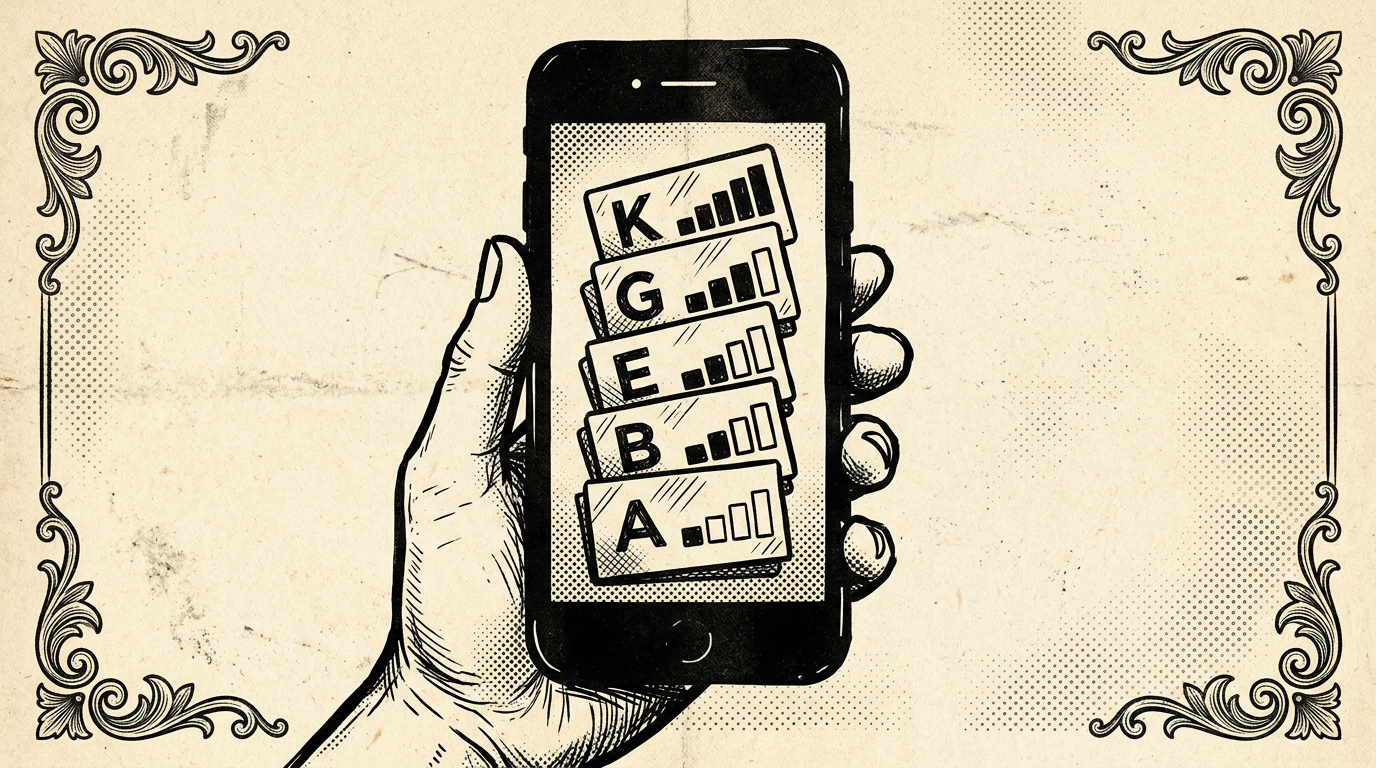
The fix I shipped is a placement-style flow for first-time accounts: after sign-up, the user picks the language they want to study and the app's main UI language. That choice grounds every prompt that follows — both for comprehension and for the model's output. Then they enter a short quiz: exactly five vocabulary challenges, generated and graded with AI.
Each item is a word test, not a long lesson. The sequence is adaptive. Answer correctly and the next question nudges harder — slightly more obscure vocabulary, longer words, or subtler distinctions depending on what the pipeline can infer from the previous round. Miss one and the difficulty steps back, so frustration doesn't compound at the worst possible moment (right after you've convinced someone to trust you with their morning alarm).
Why five? It's long enough to estimate a band of ability and short enough to finish before impatience wins. Three felt noisy — one lucky streak could skew the profile. Ten felt like school. Five sits in the valley between 'this was nothing' and 'this was a chore.' The quiz is the product handshake: proof that study will feel like study, not like filling out a form.
The model does the heavy lifting. Question text, acceptable answers, and difficulty metadata all come from the same stack that powers the rest of the app's AI features — tuned for consistency with the user's language pair and kept conservative on temperature so outputs stay exam-like rather than creative-writing loose. Parsing and sanitization still matter; a bad generation gets caught before it reaches the UI, with fallbacks that degrade gracefully rather than showing nonsense to a new user.
When the fifth answer is in, the app doesn't just show a score. It seeds the word list with a starter set: five words, chosen to match the inferred level from the whole run — not only the last question. Those five become real cards in the user's library, ready for alarms, review, and spaced repetition on the same rails as anything they add later. The deck is no longer empty; it's personalized scaffolding.
The product narrative shifts in a single flow. Before: 'Install this, then figure out how to populate it.' After: 'Tell us your languages, prove for thirty seconds that you can handle words at your level, and leave with something concrete.' The emotional beat I cared about was immediacy — this is an app you can run, not an app you have to prepare.
Instrumenting this was as important as building it. I track completion rate of the quiz, drop-off per question, and correlation with week-one alarm creation. Early data will tell me whether to shorten copy, reorder steps, or allow skipping for power users who import decks on day one. The feature is opinionated by design, but the metrics decide how hard that opinion should press.
This is not a replacement for AI Smart Scan, manual entry, or imports. It's a bridge for the user who has no deck yet and might never build one if the first screen says 'start from zero.' Sometimes the best onboarding isn't more tutorials — it's a filled shelf and a clear next step.
If you're building habit-forming tools, ask what your empty state really communicates. Empty can mean freedom, or it can mean abandonment. For vocabulary tied to a morning alarm, I needed the first impression to read as readiness. Five questions and five words turned out to be enough to flip that story.
The pattern was uncomfortable to admit: people completed signup, landed on a pristine word list, and never came back. It wasn't that the product failed — it was that an empty deck reads like 'nothing here yet,' and nothing here yet reads like homework before the homework. I started asking whether the problem was motivation or perception. The answer was both, but perception was faster to fix.
Flashcards Alarm only works when there are words to study. Alarms attach to groups; if the first screen after authentication is blank, the mental model breaks before the user has a chance to build one. I wanted the app to feel inhabited from the first session — not full, but alive. Something you could use in the next sixty seconds without hunting for a textbook or typing a vocabulary list by hand.
The fix I shipped is
...
Tags: Flashcards Alarm, Onboarding, AI, Product, UX
See Also:
→ AI Agents Are Replacing the Traditional Software Development Lifecycle→ Building a Multi-Tenant Marketplace from Scratch→ PostgreSQL vs Firestore: A Practical Decision Framework→ How GenAI Reduced Our Operational Overhead by 90%→ Building a Production Image Pipeline with AWS S3Browse all articles →Key Facts
- • Category: Design
- • Reading time: 8 min read
- • Technology: Flashcards Alarm
- • Technology: Onboarding
- • Technology: AI